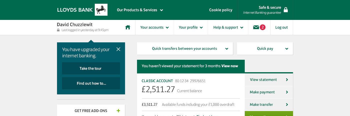
Since the major redesign of internet banking, launched over six years ago in 2010, the number of products and services offered by the bank has dramatically increased. With this, more and more customers are choosing to bank on online — increasingly through the use of smartphones and tablets.
Six years had seen a lot of change in the bank and though the existing interface was holding up admirably with the demands placed on it, it was never designed for use on mobile devices or for the scale of services now being brought online.
Work began with an externally commissioned research and concept generation phase. Its objectives were to explore how to make online banking more extensible and provide a better experience when using touch enabled devices. Though the bank's iOS and Android mobile apps were becoming widely adopted by its customers, the bank wanted to ensure it provided access to its services by as many means as possible.
Working with design agency Razorfish, I acted as a subject matter expert, offering insight to the design decisions made and challenges faced with the previous redesign (I was one of the UX design leads on this work).
Once this initial research phase had finished, the project was brought back in-house to develop the final concepts in detail and begin the rigorous work of specifying the user interface.
Throughout this period we worked closely with product teams (for instance, credit cards, savings, loans and current accounts) to understand and test the new design framework against each of their existing requirements and future proposals.
With a new in-house usability testing lab available to us, we worked with our research team to carry out extensive testing on all the major user interface design changes. This enabled us to experiment with and refine our ideas from larger navigation concepts right down to small details such as the labels on buttons. Starting with basic interactive prototypes, we worked through to ones that augmented customers' live account information, enabling as realistic tests as possible. Remote usability tests (carried out online) were also conducted to test the overall information architecture and were chosen because we could greatly increase the number of participants.
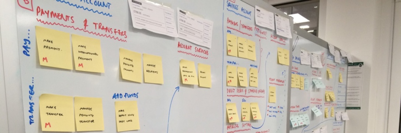
As the new design framework took shape, we had to be aware of all the possible impacts on 'in-flight' and scheduled projects within the business (some 60 to 70 in total). One of my responsibilities was to assess and manage all user experience project dependencies, providing support to other teams in cases where they would need to design two solutions — one for the existing interface and one for the new release. To aid this we created a 'live' document that captured the principles behind the new design and created and maintained a high-fidelity prototype of the new site to act as a reference for all. These were constantly updated in line with visual design and interface changes.
Delivery of the project had been organised in to sprints to allow development to begin as soon as possible. We worked to a UI specification schedule that enabled us to deliver every few weeks in line with the build team's requirements. This was also aligned with supporting visual design and copy deliveries.
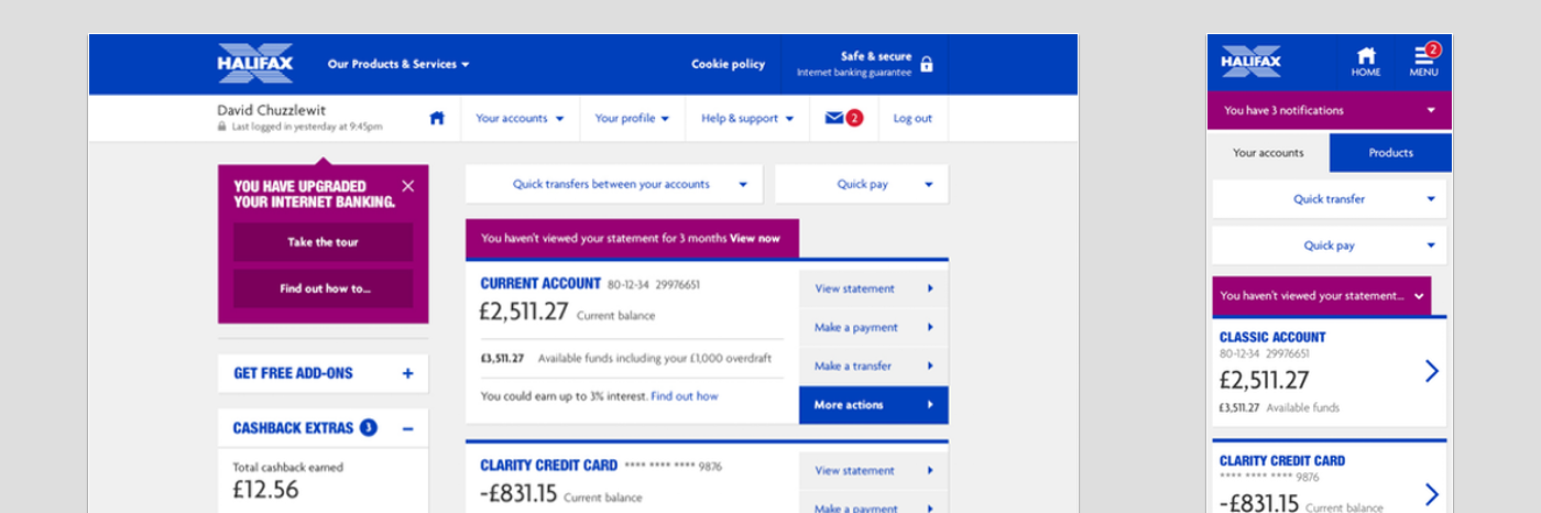
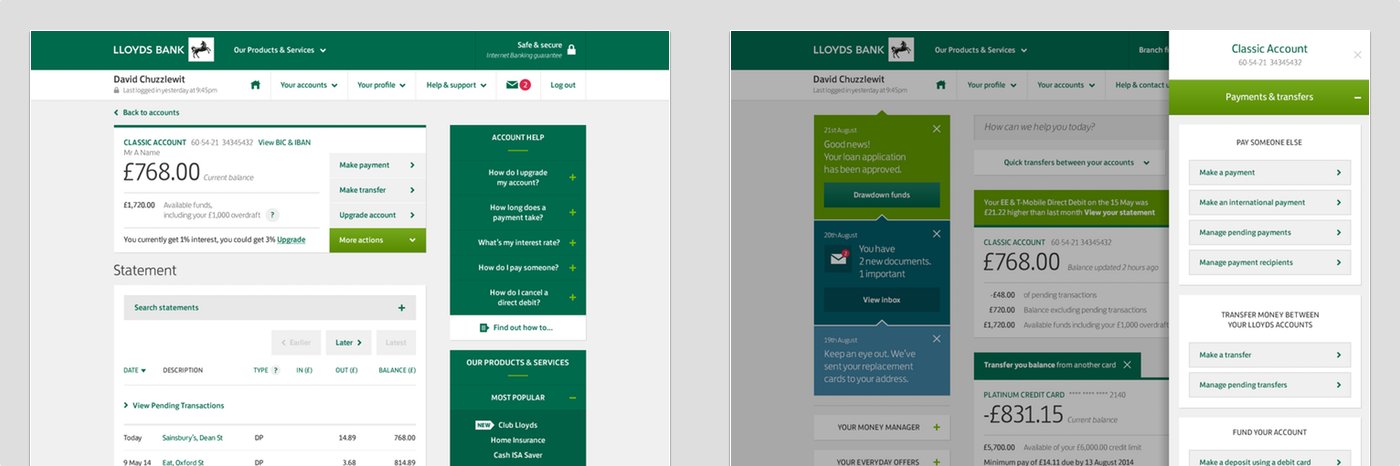
Launched in late 2015, the new responsive site enables customers to access internet banking on their mobile and tablet devices in a manner more appropriate and easier to use on both smaller and touch enabled screens.
Delivered across all three brands within the Lloyds Group (Lloyds Bank, Halifax and Bank of Scotland), the project was the first to use the new Lloyds Bank brand, which had been introduced following the split of TSB into a separate business.
The final solution was consciously designed to be an evolution — our research had shown us the personal ownership many customers had with online banking and we didn't wish to destroy this or their sense of familiarity with the service.
The following video from Halifax was one of a series created to introduce customers to the new design and explain the changes made:
Though familiar, the new user interface has been designed to support the further growth of the bank's products and services online, with many updates already being seamlessly integrated.